Wednesday, November 30, 2011

Holiday Wear

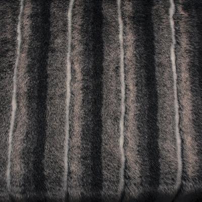
With the upcoming holiday season, I thought I would share what I think are the some of the hottest trends that are in.  Fur this season is really big.  Whether it be real or fake, all types of fur are hitting the retail shelves this season.  They are in the forms of jackets, vests, muffs, and scarfs.  Also, a big trend is to wear cordoruy pants.  They come in many different colors that you can choose from, such as red, blue, green, pink, purple, grey, white, brown, and black.  One thing that has popped out at me recently, is to wear knee high socks under your boots so that they show as the outer part of your outfit.  I have also noticed that red is a predominate color this season.  Red provides for a great emphasis on your wardrobe and is a warm color to complement the warmth of the season.  Trench coats are popular as well, however being in Texas, there really is not a need for them yet.  Metallic sweaters are very trendy right now with the silver and gold stripes on a neutral sweater to provide interest without going overboard. 


Layouts

An interesting thing that I have recently learned was about page layouts that are located in fashion magazines.  Layouts serve to direct the eye to what should be the focal point, the clothes.  There are six main types of layouts that can be chosen from.  The first layout design is called the axial layout.  This layout has a focal person or object with what appears to be branches coming off from it.  The focal point can be centered or located on the left or right.  There is also a balanced positive and negative space.  The second layout is the band layout.  This layout shows a tight proximity of design, appearing very clustered.  Usually an asymmetrical format looks best.  The third layout is the formal layout.  This is where everything on the page is balanced or symmetrical.  There is an even amount of negative space.  The fourth layout is the grid layout.  This layout takes up all the space on the page and touches all boundaries.  There is still some negative space as well.  The fifth layout is the group layout.  In this layout, there is a close proximity of the people or objects located on the page.  This provides for a nice looking layout.  The final layout type is the path layout.  This layout serves to walk the eye though the whole composition.  This can be done through line, color, or motion. 


Accessories are Key

One part, usually the last added thing, to an outfit is the accessories that are paired with it.  In drawing croquis in class, I learned the basics about accessories.  Accessories are supposed to enhance your outfit in most cases and not draw away from it.  But sometimes they also can become the main focus of your outfit such as if you have a basic little black dress and you pair it with an oversized turquoise necklace and earrings with a bracelet added as well.  Accessories are basically just geometric shapes that are put together.  The most common shapes are circles, triangles, rectangles, and squares.  It is said that a woman looks well put together if she is wearing at least four accessories with her outfits.  These accessories could include jewelry as well as hats, purses or bags, belts, shoes, headbands or hair clips, or scarfs.  Accessories can also be used to spice up a basic wardrobe and even make your wardrobe look different and new.  Accessories help to draw positive attention to a woman and they complement a woman's wardrobe quite well. 


Trends versus Classics

One thing that I have learned through drawing fashion illustrations is that there are trendy garments and classic garments.  Trends usually only last up to two seasons and then do not come back in style for years.  These are garments that you are intrigued to buy now because everybody is wearing them but later on they will end up sitting in your closet unworn.  Examples of these garments include fur jackets, jumpers, and cordoruy pants.  Classic garments on the other hand are items that are always in style and are staple pieces for your wardrobe.  Examples of these garments include blue jeans, sweaters, and t-shirts.  I think that it is more important to have a base wardrobe that include classic garments and then infuse it with a few pieces each season that are popular in the moment.  This way you will not have to change your wardrobe entirely every time new things are in style. 

Principles and Elements of Art and Design

When I created my recent illustration collection of clothing, I thought about which elements of design would work best for my target market of ages 30-55.  I chose to use the principle of similarity in order to show a cohesiveness among the five outfits.  This was shown through the repetition of waistbands located on skirts, pants, dresses, and a belt.  The waistbands also provide for the hourglass silhouette that I emphasized.  This silhouette serves to show off the smallest part of your body and therefore makes you appear at your thinnest.  I also wanted to incorporate the principle of balance and proportion.  I wanted to show balance to provide for a symmetrical view of all the garments and the eye would focus on the clothes but more so the woman behind the clothes.  I chose proportion so that the golden mean of 3:5 and 2:3 would flatter the body in the best possible way.  I used elements such as color, texture, and line.  I chose an accented neutral color scheme with deep shades of blue in order to show a color pop but also not come off as too busy.  I used texture through my fabric choices of crepe, fur, knit, and cotton sateen.  The texture provides for some interest to draw the eye in to the clothes.  I used curved lines, besides the darts, in order to give off the themed effect of flower petals as well as show femininity in the garments.  These curved lines are located in the princess seams, the cut-out petals, the seam lines on the skirt, as well as the curved line jacket with a cloverleaf lapel and the the fur vest with a chelsea collar.  There are many other elements and principles of design but these previously mentioned I felt like were most important to incorporate in my collection.


Friday, October 21, 2011

Rendering the Croqui

Hi all! Here are a few tips on how to render garments on a croqui to give it a life-like quality.   

When drawing garments on a croqui they are supposed to show movement as if they are dancing off the page unlike when drawing a flat of a garment.  After the garment is drawn on the croqui, the next step is to render it using prismacolor markers and pencils.  A color scheme is first established.  Many schemes are available to choose from including analogous, achromatic, complementary, monochromatic, split complementary, and triad.  The color scheme chosen is important because it will combine with the stance of the croqui and the design and shape of the garment to convey a mood.  Shades, tints, and values will help the garment appear three dimensional on the page.  When rendering the body there are three steps.  First a base skintone is applied, second shading is added where shadows occur and last highlights are added back to create movement.  Rendering garments is a similar process.  The prismacolor pencils come into play at the end and are used to establish patterns and texture in garments.  When rendering garments to avoid flattening the clothes should not be outlined in black and multiple shades and tints should be used.  Also, the lines of the garment should contour with the shape of the body. 

Friday, September 30, 2011

Silhouettes

There are six main silhouette styles that occur in garments of clothing.  A natural silhouette is a garment that fits snuggly to the body, such as a bathing suit or a leotard.  A slim-line silhouette conforms to the body however there is a small amount of breathing room included.  Someone should wear this type of silhouette if they are looking to show off their curves.  The hourglass silhouette is probably the most commonly talked about silhouette.  This style is more full at the top and bottom of the garment and cinches at the waist.  This is a very flattering silhouette because the waist is the smallest part of one's body and makes anyone appear thinner.  The fourth style of silhouette is the soft silhouette.  This style does not hug the body but instead is more like a sack put on the body.  One would wear this style if they were looking to hide their curves.  A wedge silhouette is where the body appears to be in a triangle shape.  The wedge can occur at the shoulders (most common) or at the bottom of the garment.  Big shoulder pads can create this effect where the shoulders appear much larger than they are.  This in turn makes the body appear much smaller in comparison.  Someone would wear this style if they wanted to hide a certain part of their body and make it look thinner to the public eye.  The last silhouette type is the full-volume silhouette.  This silhouette completely hides the shape of the body.  If someone wants to wear a dramatic garment this is the silhouette to wear. 

Monday, September 5, 2011

Croquis To Humans

Hey everyone!

The main focus behind my blog is to show how different croquis represent different body types and how you can take that croqui and translate it to the human body.  I will show what clothes and fashion tips are best to use for the body type that I am currently learning about.  Hope y'all enjoy!